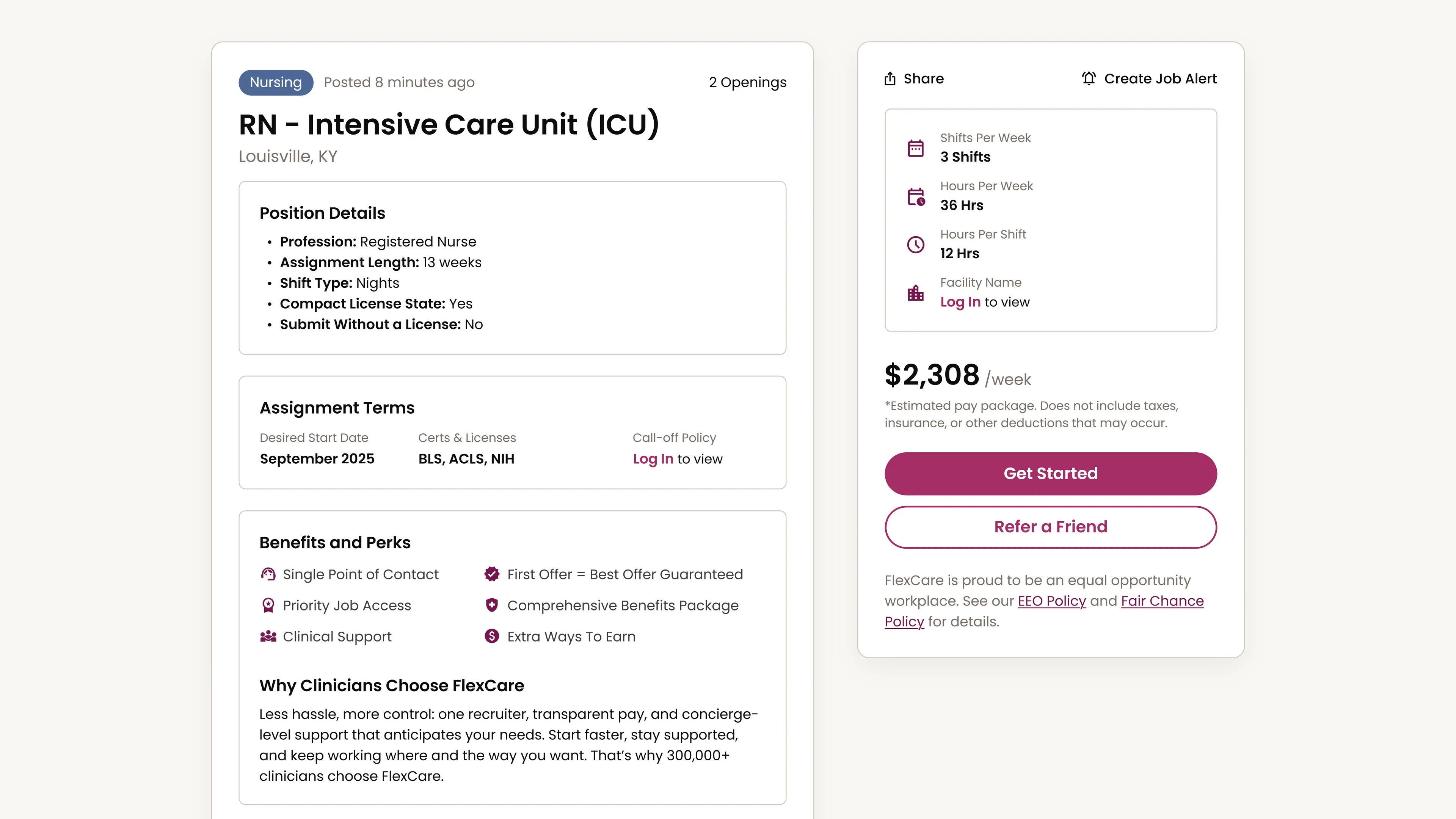
FlexCare places travel nurses and allied clinicians in short-term assignments at hospitals across the US. Clinicians often compare several jobs at once, sometimes across multiple agencies and after 12-hour shifts. But the job page made that comparison harder than it needed to be. The details that shaped a decision were buried in the company's own content, so clinicians hunted for the same facts on every job. And pay, the fastest way to qualify a job, showed only as a range, with the exact pay coming only after recruiter contact.
As the only designer, I redesigned the page around how clinicians evaluated an assignment. I pushed to show exact weekly pay upfront and worked with our PM to decide what should stay behind the login, so showing more wouldn't cost sign-ups. After launch, job board views rose 19.8% month over month while conversion held steady.
- Role
- Product designer
- Team
- Designer (me), PM, engineering
- Timeline
- 7 weeks
- Scope
- Desktop, mobile web
Problem
The company's content buried the decision
The old page treated job details, marketing, referrals, and policy copy with nearly the same visual priority. The information clinicians needed to judge an assignment was split across the page, while everything around it competed for attention.
Comparing jobs meant repeatedly scanning past content that didn’t help answer whether the assignment was worth pursuing.

Redesign
The job comes first
I put the job first and everything around it second. The details clinicians judge an assignment by lead the page, and the company, referral, and compliance content stays on the page without competing with them. The exact weekly pay now sits with the job, and an account unlocks the rest.

Decision order
We organized the page around the questions clinicians asked first
Early feedback from a small group of clinicians, the questions recruiters kept hearing, and our PM’s years in recruiting all said the same thing. Clinicians needed to know whether a job fit before anything else asked for their attention.
The harder question was what to do with everything else. It still had a reason to be there, just not the same weight as the job itself. Referrals moved beside the primary action, so a clinician passing on a job can still share it with someone who’d want it.

Real postings
The layout holds up for any posting
The hierarchy also had to survive incomplete data. Hospitals don’t send FlexCare a consistent set of job details, so a layout that worked for a rich posting could fall apart on a sparse one.
I replaced the fixed grid with flexible lists that expand, shrink, or disappear with the content. The structure stays intact whether the data is complete or bare.

Product page
Shaped like a product page, on purpose
I borrowed a pattern clinicians already know from shopping online. A product page keeps the few facts you need right before buying next to the button, with the rest of the details beside them.
I explored 5 structures, but the decision came down to 1 or 2 columns. A single column gave us a predictable reading path and translated cleanly to mobile, but spread the decision across a long scroll. A summary rail added complexity, but kept the highest-value facts and the action together while the full job remained readable beside it.
I recommended the 2-column approach, and leadership agreed.


Goldilocks gate
Everything needed to decide stays public
Clinicians were frustrated when a job paid at the bottom of its range. I pushed to show the exact weekly pay upfront, a single number they could trust and compare across jobs and agencies without contacting a recruiter.
That created a business problem. With the exact pay public, clinicians had one less reason to sign up, so we needed a new one, something they’d want to know that didn’t hide what they needed to judge fit.
Our PM and I drew the line at the facility name and call-off policy. Both mattered, but neither was necessary to compare the role, pay, location, schedule, or requirements.
The catch was that a clinician avoiding a specific hospital, or checking a call-off policy, now had to sign in before ruling the job out.

Impact
More views, steady conversion
Job board views rose 19.8% and engagement 18.9% month over month after launch, while conversion remained steady. Leadership had worried that showing more would cost sign-ups, and the first numbers after launch showed no drop.
Reflection
I'd test the finished page with clinicians first
The biggest gap was validation. We had useful signals for the hierarchy, but the finished experience was never tested in front of clinicians before launch.
Next time, I’d test whether the new order matches how clinicians actually compare jobs and whether the login gate is enough to make them sign up. Once live, I’d measure the gate independently instead of trying to read its effect through whole-page conversion.