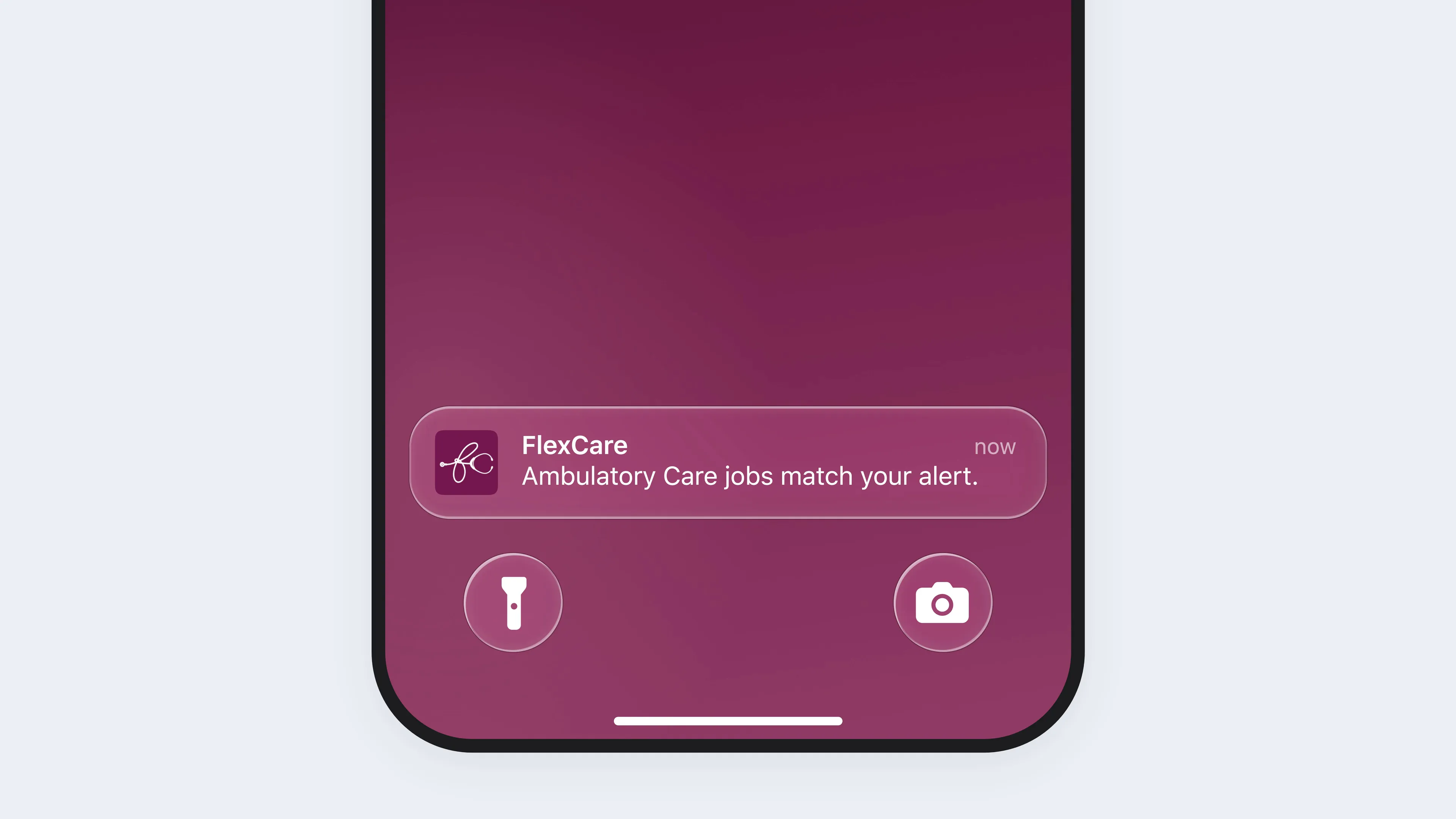
The lower half of an iPhone in a black frame, its lock screen in FlexCare's magenta. FlexCare's notification, Ambulatory Care jobs match your alert., sits above the flashlight and camera buttons, slips down into the bottom of the screen, then rises again, stretching tall and then wide as it settles back in place.

Making job alerts a reason to come back

2026

FlexCare's job alerts tell travel clinicians when a job they want is posted. Clinicians look for their next assignment before the current one ends, so an alert is FlexCare's chance to reach them before another agency does. But the Job Alerts page was built to store preferences, not to find jobs. Setting up an alert meant filling in every field, and the page never showed what an alert had found.

As the only designer, I redesigned job alerts around finding work, from the setup to the emails. I argued for bringing each alert's jobs onto the Job Alerts page, so clinicians no longer had to leave it to search. Everything launched in June 2026, including the job matches engineering first pushed back on.

Role
Product designer
Team
Designer (me), PM, engineering, lifecycle marketing
Timeline
3 months
Scope
Web, app, email

Job alerts worked like a settings screen

There was no research on job alerts, so I audited them myself and found 10 issues. The setup wouldn’t save until every field was filled, and its error message never said which was missing, only to contact a recruiter or email support.

Once saved, an alert showed just its specialty and state, with the same toggles from the setup, so alerts that shared both looked nearly identical. Telling them apart meant opening each one, and every edit reordered the whole list. Seeing matched jobs meant leaving the page for a job search, with nothing to show the alert’s preferences had carried over.

The old Create New Job Alert panel open over an ICU job page, prefilled with Intensive Care Unit (ICU) and CA, app and email alerts on. The cursor opens Shift Type, whose 6 options, Days to Variable, have nothing ticked, scrolls, looks down the options without choosing any, and clicks Save. The panel closes and a red banner lands at the top of the page, Unable to Save Job Alert, saying only to contact a recruiter or email support if the issue persists, never which field. The cursor closes the banner and opens Create Job Alert again.
The old setup, rebuilt from my audit's captures.
Two old saved alerts from my audit, side by side on a soft blue ground: aubergine cards that both read Intensive Care Unit (ICU), CA, one created an hour ago and the other 36 minutes ago, each with Run Search, Edit, and Remove, and under Contact Preferences, the same toggles for mobile app, email, and text alerts, the first 2 on. Callouts: Identical at first glance, across both cards; Missing key details, at the title and state; Unclear CTA takes user off page, at Run Search; and Repeated toggles take up extra space, at the toggles.
Job alerts before the redesign, March 2026, from my audit.

Alerts you can tell apart

With several alerts on the page, clinicians need to know which alert is which, not how each one notifies them. I left the toggles in the setup, where they already lived, and gave their place on the card to what the alert is set for, like its location, pay, and shifts. The created time came off, since it said nothing about the jobs, and Remove moved into the setup, one step further away. Edits still reorder the list, but alerts no longer get mixed up.

4 redesigned saved alerts in 2 rows on a soft blue ground, white cards each with a pencil: Ambulatory Care in Sacramento, CA and in Los Angeles, CA, then CT Tech in New York, NY and in Los Angeles, CA, each listing its distance, pay, shift type, hours per week and hours per shift. Callouts: Kept only necessary action buttons, at the first pencil; What / where first, at the specialty and location; Key details added, at the details; and Distinguishable without opening, across the bottom row.
Job alerts after the redesign, from my final design.

Replacing a search button with the jobs themselves

I argued for removing Run Search, the button that sent clinicians off to a job search. The alerts’ jobs would show right on the Job Alerts page instead, so clinicians never had to leave it. Your Matches holds jobs that fit the clinician’s alerts, and Suggested for You adds jobs just outside them. Engineering pushed back on what should count as a suggestion, and on keeping matches current as jobs were posted and filled. Both rows shipped.

With the specialty already set by the alert, I tried job card layouts that led with pay or with location. I chose location, since clinicians can only take jobs in states where they’re licensed, and FlexCare knew they ranked location first, then pay.

The Job Alerts page in the app, on a phone cropped at the frame's foot, on a soft blue ground. It opens on Your Job Alerts, with Create Alert and an Ambulatory Care alert in Sacramento, CA. A finger flicks the page up past the alerts to Your Matches, where the first job reads Sacramento, CA, $1,974.28 a week, Ambulatory Care, marked New. Two taps on the row's arrow page to Los Angeles, CA at $2,926.40 a week, then New York, NY at $1,677.90 a week, CT Tech, each card leading with its city. A flick down returns to the top.
The shipped Job Alerts page in the app, its matches right under the alerts.
The same job card in 2 versions side by side on a soft blue ground, an Ambulatory Care job in Sacramento, CA at $1,974.28 a week, marked New. On the left, labeled Pay first, the pay leads, then the specialty and the city. On the right, labeled Location first, shipped, the city leads, then the pay and the specialty. Both then list Days, 13 weeks, 48 hours a week and 12 hours a shift, Added 30 min ago, and View Details.
Pay first and location first, which shipped, from the job card layouts I explored.

Asking only for what a match needs

Every required field was another way for the setup to fail, but an alert with nothing to match on is no use either. I made the primary specialty the only thing a clinician has to fill in, since no match works without it. The catch is that a specialty-only alert can send jobs a clinician would never take, until they narrow it.

Location had been a state field or a city field, and a city typed into the state field wasn’t recognized. I merged them into one field that reads a city, state, or ZIP and holds several locations. A whole state turns distance off, since there’s no single point to measure from. The first build missed that rule from my design, and I caught it in QA.

Job Alert Settings in the app, twice, side by side on a soft blue ground. On the left, labeled Only specialty needed, a new alert with just Ambulatory Care as its specialty, no location, app and email on daily, and Distance, Pay, Shift Type, Hours Per Week and Hours Per Shift closed with no choices, Save alone in the footer. On the right, labeled Saved with preferences, the same alert with Sacramento, CA, app hourly, and Within 50 Miles, $1,500+, Days, Eves, Mids, 40, 48 and 12 chosen, with Delete job alert and Save.
One panel creates an alert and edits it later, shown in the app.
Job Alert Settings on a desktop, on a soft blue ground, for an Ambulatory Care alert in Sacramento, CA, with Distance set to Within 50 Miles. The cursor clicks into Location, types Cal, and picks California from the suggestions, and its chip joins Sacramento's while Distance stays on. Then the cursor removes Sacramento, California slides into its place, and Distance greys out, its value replaced by the line Select a city to filter by distance.
Distance measures from cities, so it stays on beside Sacramento and turns off once only the state is left.

The cleaner email lost clicks, so I brought View Job back

My first alert email put 2 buttons on every job, Request Details and View Job. In the next, I made each whole job a link, as LinkedIn’s job emails do, and cut details so the email stayed short. After launch, the click rate dropped, which suggested clinicians didn’t know the jobs could be clicked. I put a View Job link on each job, and in our lifecycle marketer’s A/B test, that version drew more clicks.

The job list from 2 versions of the alert email, side by side on a soft blue ground, each a white card with the same 3 sample jobs: Providence, RI at $3,069.04 a week, Saint Louis, MO at $2,869.84, and Dayton, OH at $2,251.00, each an RN Emergency Room job with its shift type, start date and facility. On the left, labeled At launch, the jobs have no button or link. On the right, labeled View Job added, won the A/B test, each job ends in a View Job link with an arrow, so the card runs longer.
From my design files, with sample jobs.

Shipped in full

The setup, the Job Alerts page with both rows of jobs, and the alert emails launched in June 2026. Beyond the email’s clicks, job alerts weren’t tracked, so there’s no number for how many clinicians they kept.

I'd measure alerts by the jobs they lead to

Job alerts were a retention tool, meant to keep clinicians with FlexCare for their next assignment. Next time I’d work with our PM before launch to track the job inquiries that trace back to an alert, then follow those clinicians to their next assignment.